- 01 The problem
- 02 My role
- 03 Context
- 04 Discovery
- 05 Key decisions
- 06 The system
- 07 What shipped
- 08 What I learned
Ads were guessed first and paid for later.
Creative teams at large brands and agencies had no reliable way to know whether an ad was strong before it went live. The answer came from A/B tests, which meant slow feedback and real budget spent on creatives that were never going to perform.
I designed Preflight from a blank page.
The idea came from our CEO and product manager, based on what customers kept asking for. From there, the design was mine: the research, framing the problem, the product strategy and direction, the design language, and user testing. The deadline was short, so I designed directly in code.
I did it alongside our product manager and the engineering team, who were part of every step.
A new product, built as a layer on an existing platform.
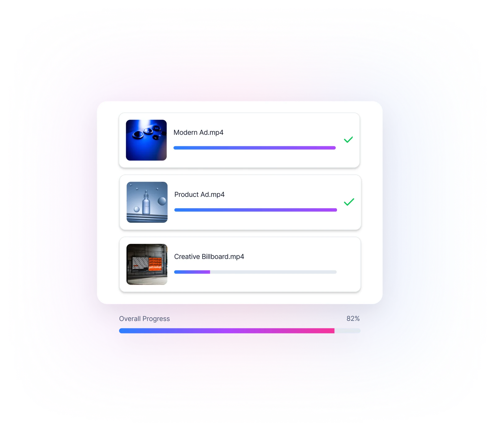
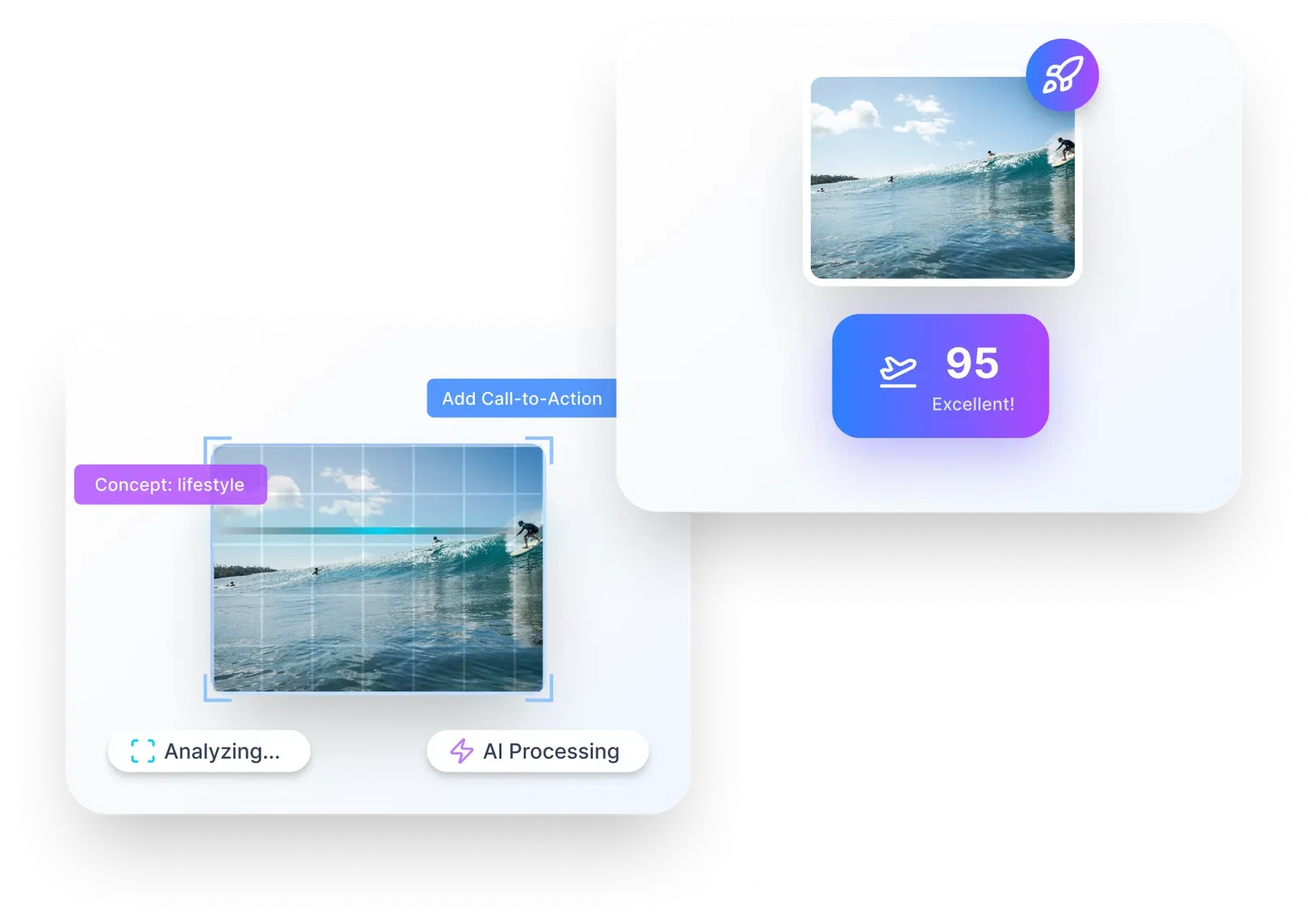
Preflight is a standalone product that sits on top of Alison's creative intelligence platform. Teams upload a video, and within 30 seconds an AI agent tags every element and scores it twice: once against Google's ABCD, Meta and LinkedIn creative frameworks, and once against the team's own historical results. They get back one score from 1.0 to 10.0, both sub-scores, and recommendations that name exactly which elements to keep, fix or remove.
A score on its own doesn't earn trust.
In research and testing, the same pattern kept showing up. People didn't act on a number they couldn't explain. A "7.7" with no reasoning felt arbitrary, and one confident score that turned out to be wrong was enough to make someone stop trusting the tool.
Designing for trust, not just for a result.
- 01
Show the reasoning behind every score.
Each score breaks down into weighted categories, such as story, product, graphics, structure and context, so people can see where the number comes from.
- 02
Make every insight something you can act on.
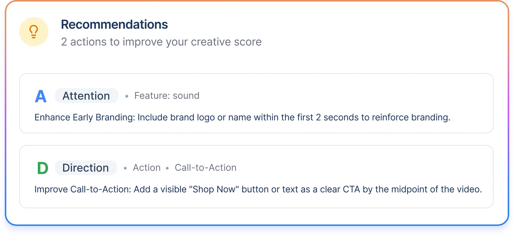
Recommendations name the exact element to change and why, using the platform's own creative framework.
- 03
Let the AI say when it isn't sure.
When confidence is low, Preflight says so. Admitting uncertainty costs far less than one confident mistake.
A new design language for explaining AI.
I created Preflight's design language from scratch, as its own layer within the platform: score cards, category breakdowns, attribute rows with clear status tags (Excellent, Fair, Needs work), and recommendation cards. Together they make a complex analysis readable at a glance.
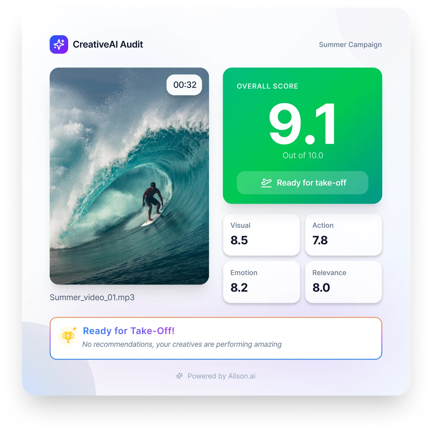
Preflight launched and took off.
It was sold through partnerships with Meta and Google, and later LinkedIn, and is used by teams at brands such as PepsiCo, Airbnb and Zara. Instead of paying for answers through A/B tests, teams now know before launch whether a creative is ready. Alison's published customer results include a 101% ROI uplift for SciPlay and a 106% lift in ThruPlays for Ferrara Candy Company.
AI isn't black and white, and the design shouldn't pretend it is.
A score by itself says very little. To earn trust, you have to explain why the agent reached its answer, understand what a mistake costs the user, and be honest when the AI isn't sure. People make mistakes, and so does AI. Saying "I'm not sure" costs far less than showing something wrong and losing the user's trust.